Designing an ethical investment experience for MoonPay
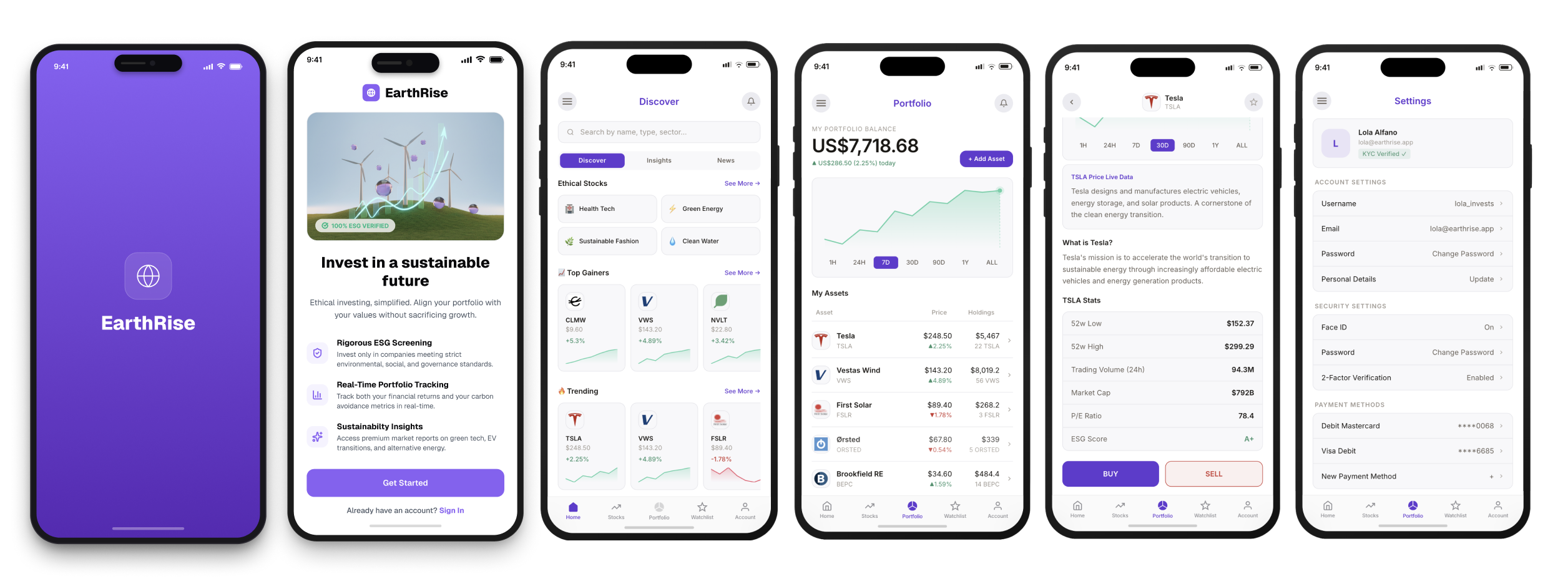
MoonPay wanted to explore a new investment proposition for people who wanted their money to reflect their values. I designed Earthrise, a mobile investing experience that makes it easier to discover, understand and invest in companies focused on areas such as clean energy, sustainable technology and responsible innovation.
My contribution
Product & UX Design
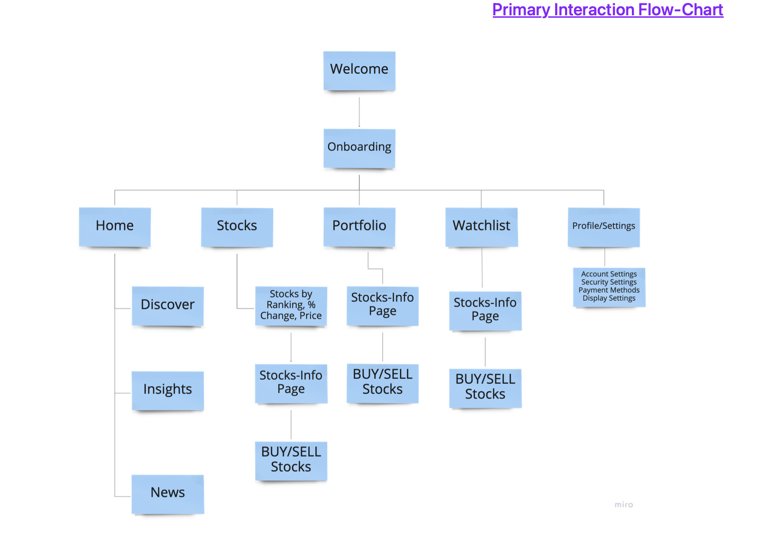
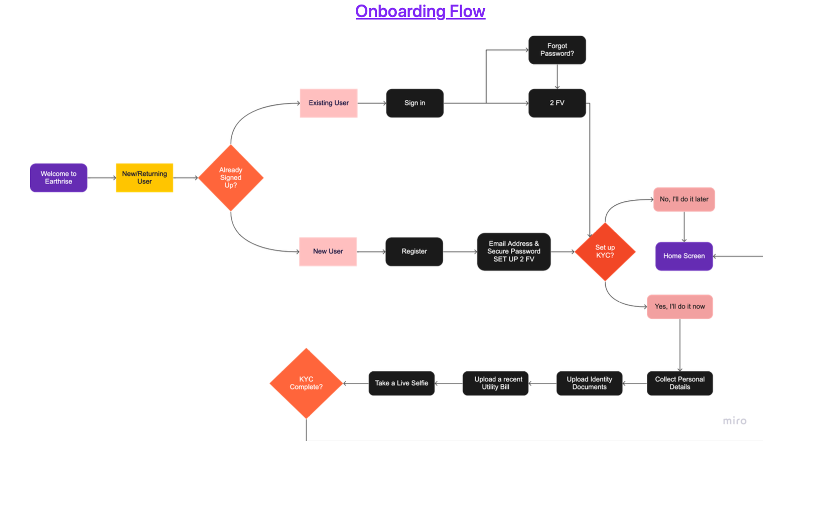
Information architecture, user flows and key investment journeys
UI & Interaction Design
High-fidelity mobile interfaces and interaction patterns
Design System
Reusable components, states, typography, colour and theme architecture
Prototyping
Interactive Figma prototype covering core product journeys
Accessibility
Contrast, hierarchy, semantic colour and WCAG AA considerations
The Challenge
Investing is already complex. Ethical investing adds another decision layer.
Earthrise needed to help users answer three questions quickly:
Is this a company I believe in?
Understand sectors, sustainability themes and company context.
Is this a company I want to invest in?
See performance, price movement and relevant financial information.
What should I do next?
Move naturally from discovery to research, watchlisting, portfolio management or investment.
The challenge was to surface enough information to support confident decisions without turning the product into a dense trading terminal.
The Approach
I structured Earthrise around four stages — Discover, Research, Decide and Track — identifying the information and actions users needed at each point.
From there, I developed the navigation, interaction patterns and visual hierarchy around progressive disclosure, keeping detailed financial information available without overwhelming the core journey.
Designing the experience
Discover → Research → Decide → Track
01. Discover
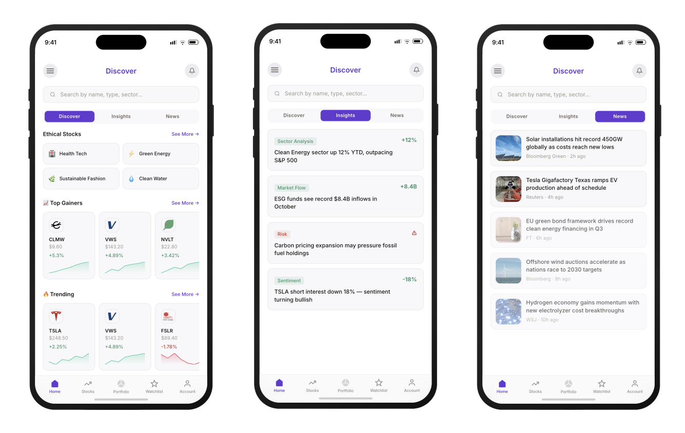
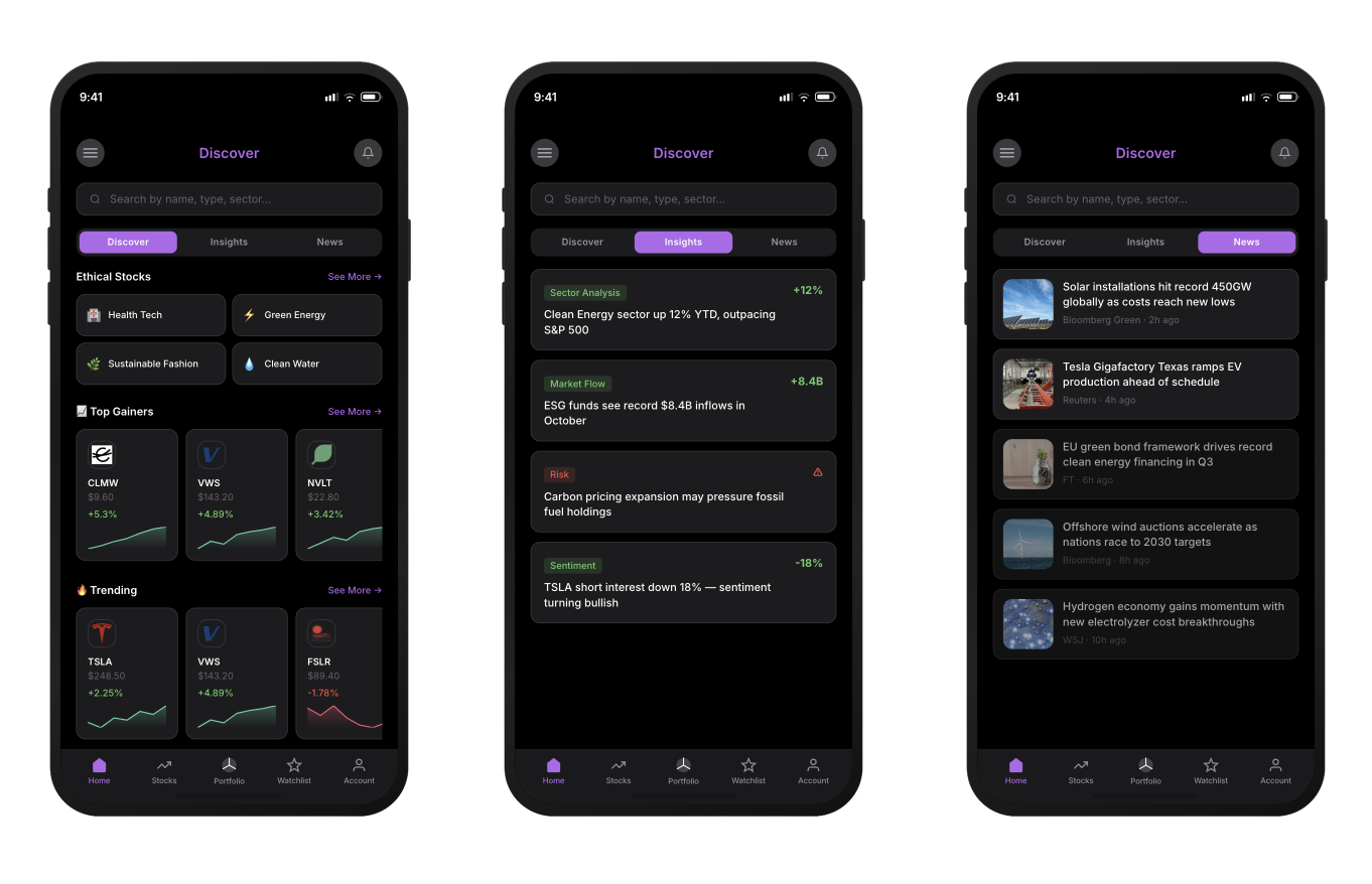
I designed discovery around intent rather than presenting users with an undifferentiated stock market. Ethical categories such as Green Energy, Health Tech, Sustainable Fashion and Clean Water create an immediate route into the product, while trending stocks and market insights support broader exploration.
02. Understand before investing
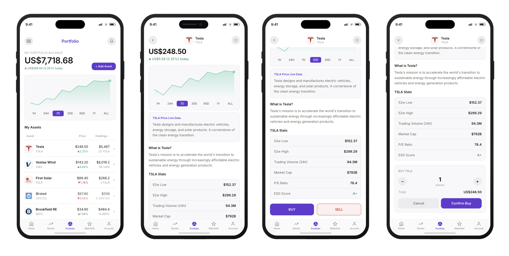
Company pages combine market performance with contextual information, giving users a clearer picture of both the investment and the organisation behind it. Time-based chart controls support quick comparisons, while company information, market data and ESG-related indicators progressively reveal more detail without overwhelming the initial view.
03. Turn research into action
The interaction model keeps the primary investment action close to the information used to make that decision. Users can move from reviewing performance to buying or selling without losing context, with the transactional layer introduced only when it is needed.
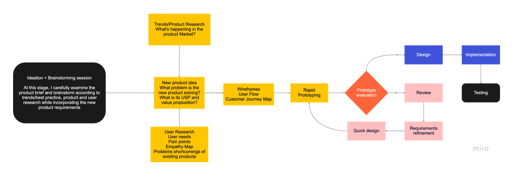
I then used the clickable prototype to explore the complete flow rather than isolated screens — including stock discovery, filtering, watchlisting, company research, portfolio monitoring and investment actions.
04. Track
Portfolio architecture – Information at a glance
Portfolios and watchlists were designed for repeated, high-frequency use. Rather than requiring users to open individual investments, compact rows combine company identity, current price, holdings, performance and micro-chart trends in a highly scannable structure.
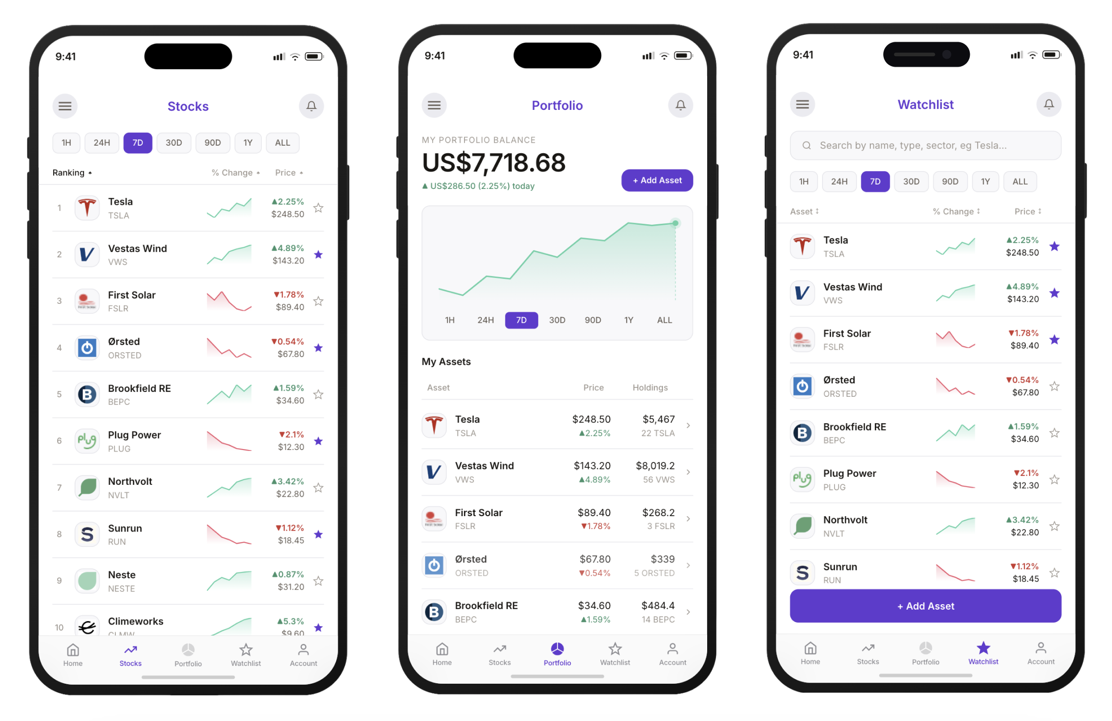 One system. Two environments.
Light and dark modes were designed as two expressions of the same system rather than simply inverting colours.
The light theme uses open space, subtle dividers and restrained surfaces to create a familiar financial-product experience. In dark mode, stronger surface separation, brighter semantic colours and a higher-luminance brand accent preserve hierarchy and legibility against near-black backgrounds.
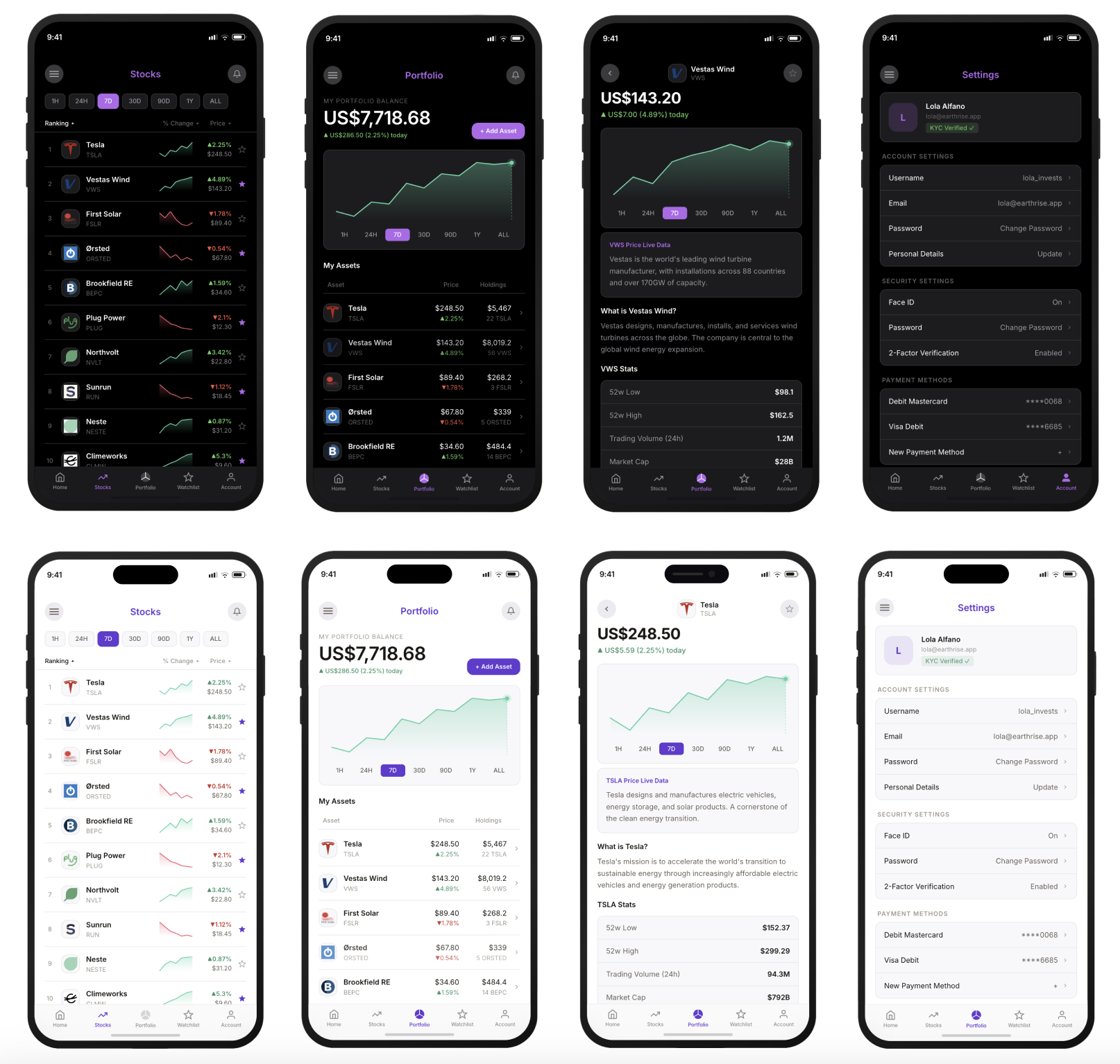
Building the Earthrise design system
Consistency had to extend beyond individual screens.
As the product expanded across discovery, investment, portfolio and account journeys, I created a reusable UI system to establish common rules for colour, type, components, interaction states and financial data.
The system was designed simultaneously for light and dark environments, using shared component structures with theme-specific semantic tokens. This allowed Earthrise to maintain the same hierarchy and interaction model without treating dark mode as a simple visual inversion.
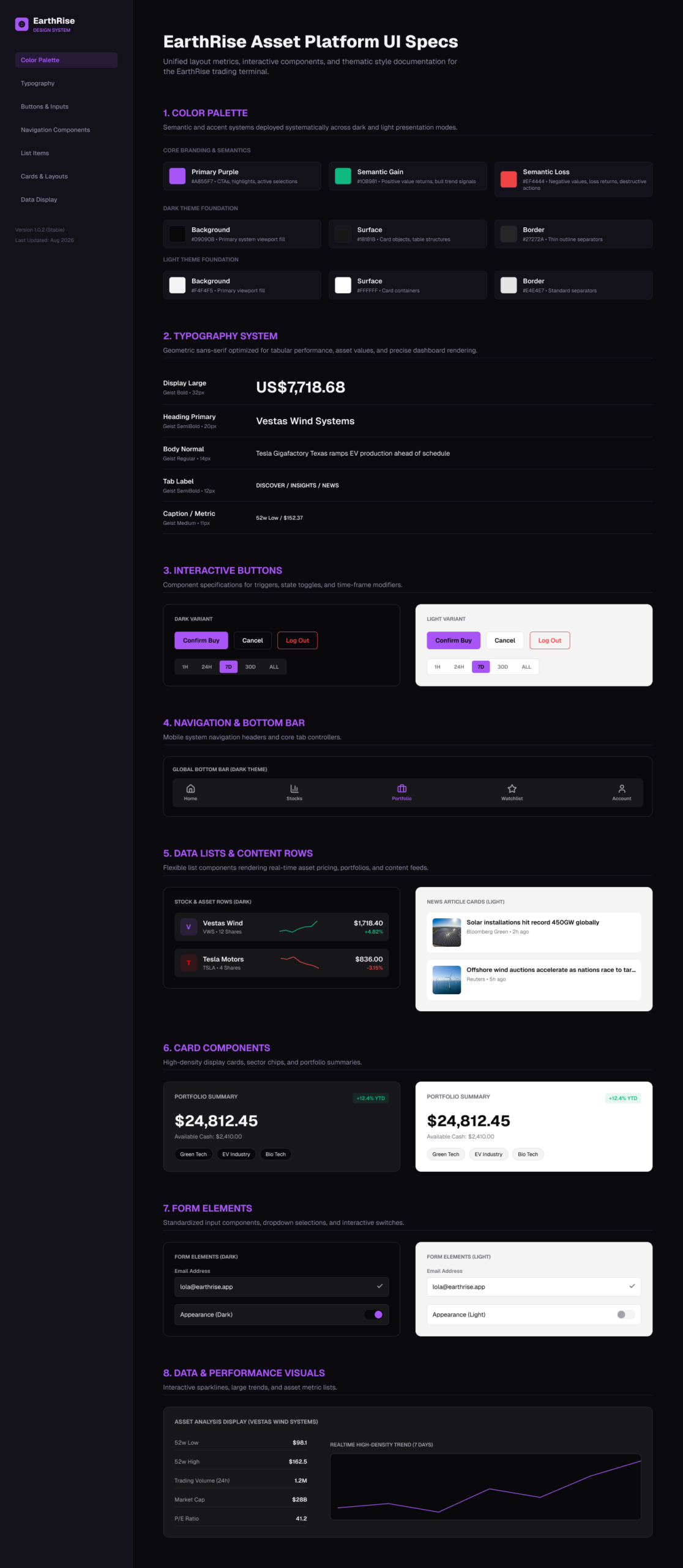
8 system foundations
Colour & semantic tokens · Typography · Actions & controls · Navigation · Content patterns · Cards · Forms · Data visualisation
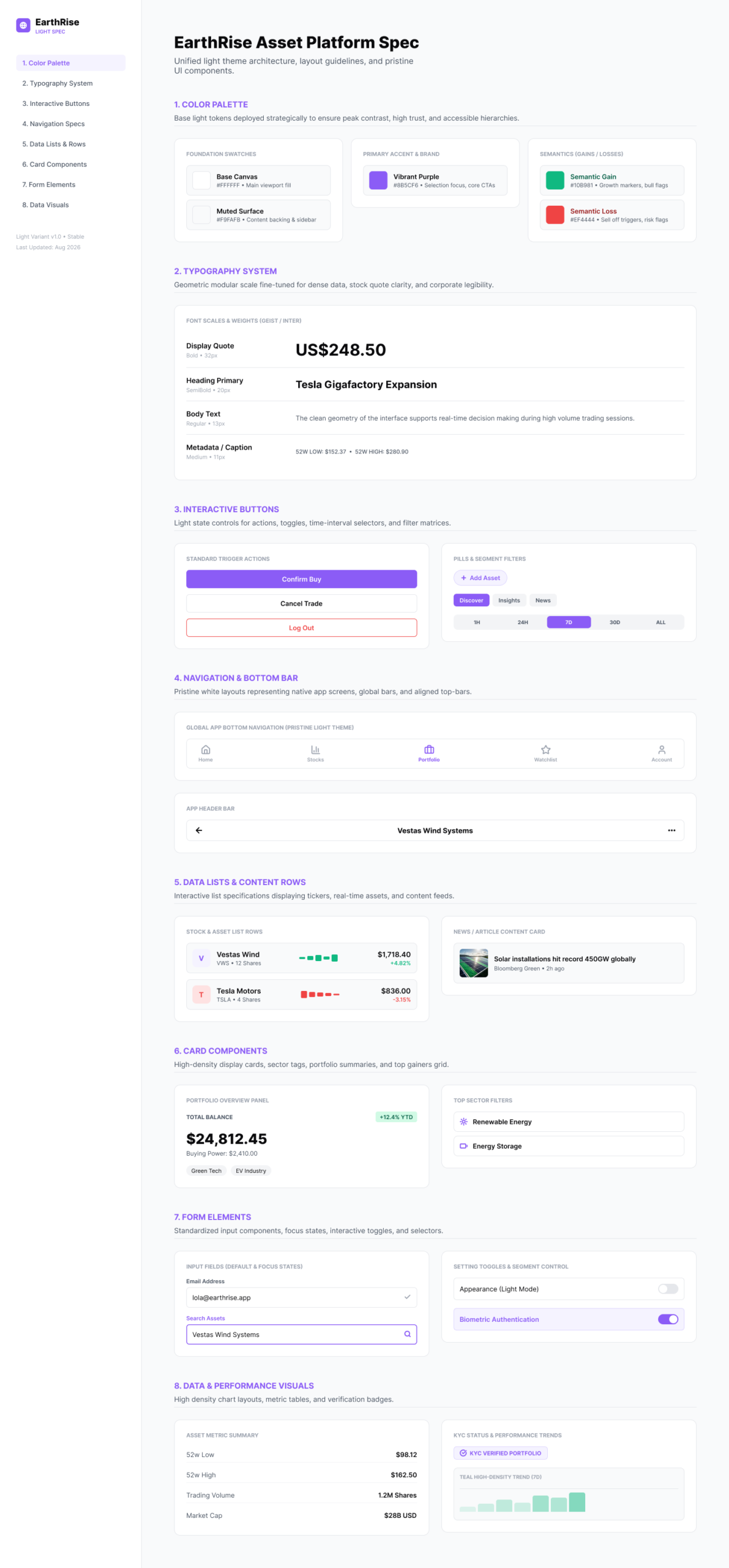
One component system. Two visual environments.
Light
Bright surfaces, restrained borders and a deeper primary purple create a clear, familiar financial interface.
Dark
Near-black backgrounds, elevated surfaces and a higher-luminance violet preserve the brand while maintaining foreground contrast and hierarchy.
Shared behaviour
Spacing, typography, component anatomy and interaction behaviour remain consistent between both themes.
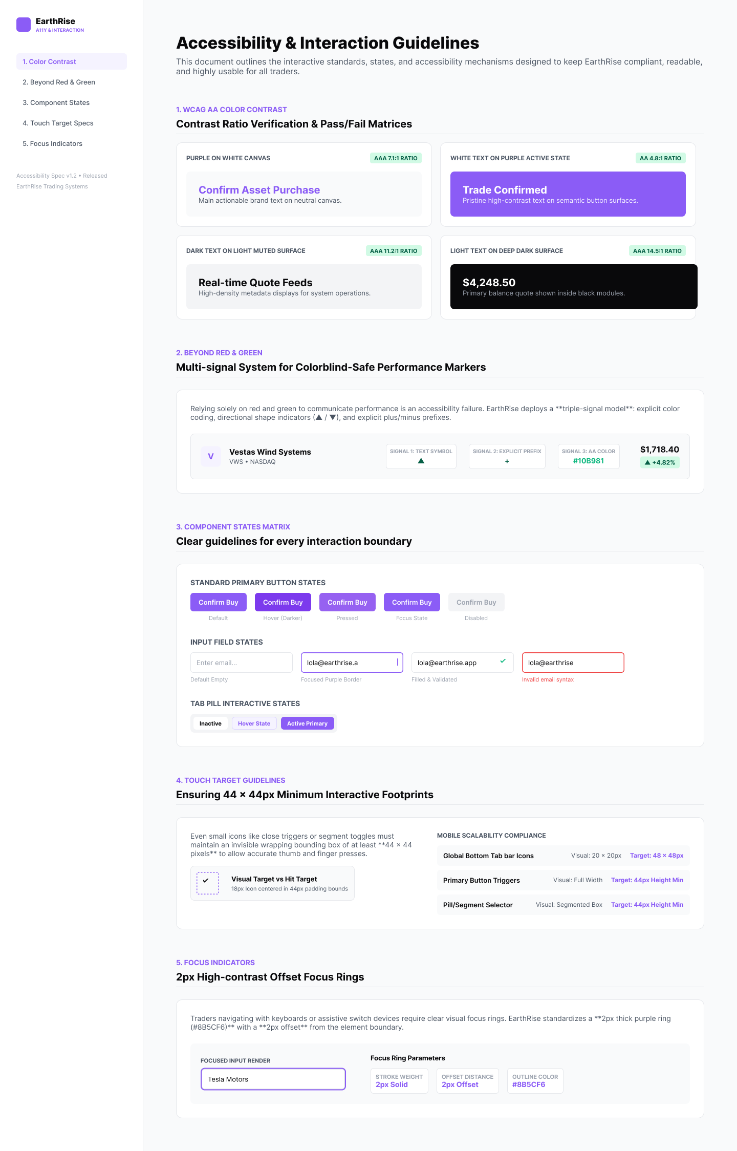
Accessibility & interaction built into the visual language
Accessibility considerations informed the colour system, hierarchy and interaction states throughout the interface. Financial movement combines colour, directional indicators and signed values, while navigation, selection and watchlist states use multiple visual cues rather than colour alone.
For example
▲ +2.25% rather than just green.
▼ −1.78% rather than just red.
Outlined versus filled watchlist stars.
Selected tabs have both colour + container/state changes.
Active navigation has icon + label + colour.
Positive and negative market movement combines colour with directional indicators and signed values, ensuring that information remains understandable without relying solely on red/green differentiation.
The Outcome
The final design translated the Earthrise proposition into a coherent, high-fidelity product experience, demonstrating how ethical discovery, investment research and portfolio management could work within a single accessible interface.
The accompanying design system and interactive prototype created a scalable foundation for future product development and stakeholder evaluation.
Client MoonPay
Product Earthrise
Role Product Designer
Platform iOS & Android
Scope UX, UI, design system & prototyping
Stage Product concept & pre-launch
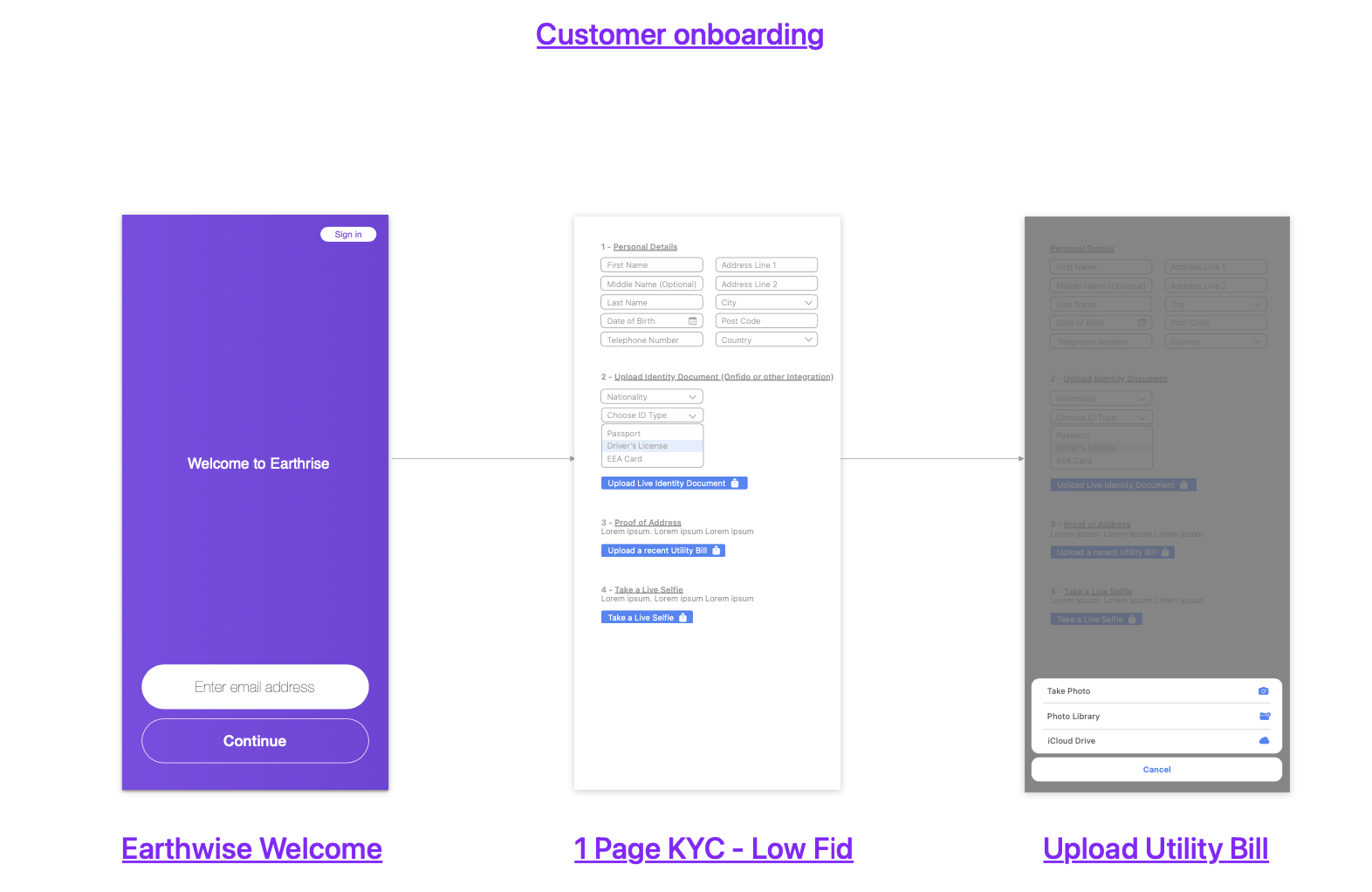
Early Exploration:
From early concepts to the final Earthrise experience
Early layouts were used to test structure, information hierarchy and key user flows.
These explorations helped shape the product architecture and informed the final design.
Purpose
Validate layout, content priorities and navigation patterns before visual refinement.
1. Home (Discover)
Entry point for discovery and market overview.
Focus: Category cards, quick shortcuts and market highlights.
2. Home (Insights)
Insights, news and education to support decisions.
Focus: Market insights and educational content.
3. Stocks List
Browse and compare stocks at a glance.
Focus: Performance ranking, changes and price visibility.
4. Stock Detail
Deep dive into company information and charts.
Focus: Company overview, performance and actions.
5. Portfolio
Encouraging users to view their assets.
Focus: Add Asset journey and call-to-action.
6. Watchlist
Allowing users to organise assets that interest them.
Focus: Add Asset journey and call-to-action.
7. Settings
Manage account, security and preferences.
Focus: Account management, preferences and theming.

What we learned
- Discovery and education needed a stronger separation.
- Portfolio required clearer actions and performance visibility.
- Watchlists and settings were essential user needs.
- Search, filters and theming enhance usability and control.
- These insights shaped the final experience and design system.